
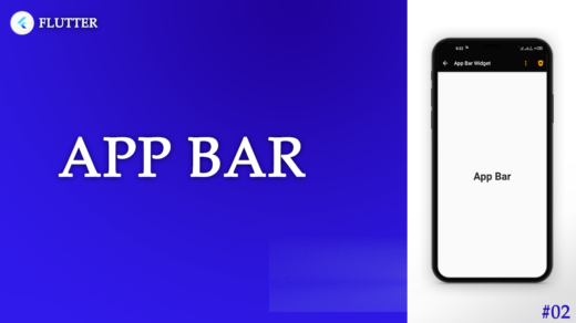
Flutter AppBar: The AppBar, a staple in modern mobile application design, serves as the navigational hub and information center at the top of the screen. In Flutter, the AppBar widget is a versatile and customizable element that frames the user interface, offering both functionality and aesthetic appeal.
Flutter’s AppBar is more than just a static component; it is the key to a cohesive user experience. This article will guide you through the AppBar’s features, its customization options, and how to integrate it seamlessly into your Flutter applications.
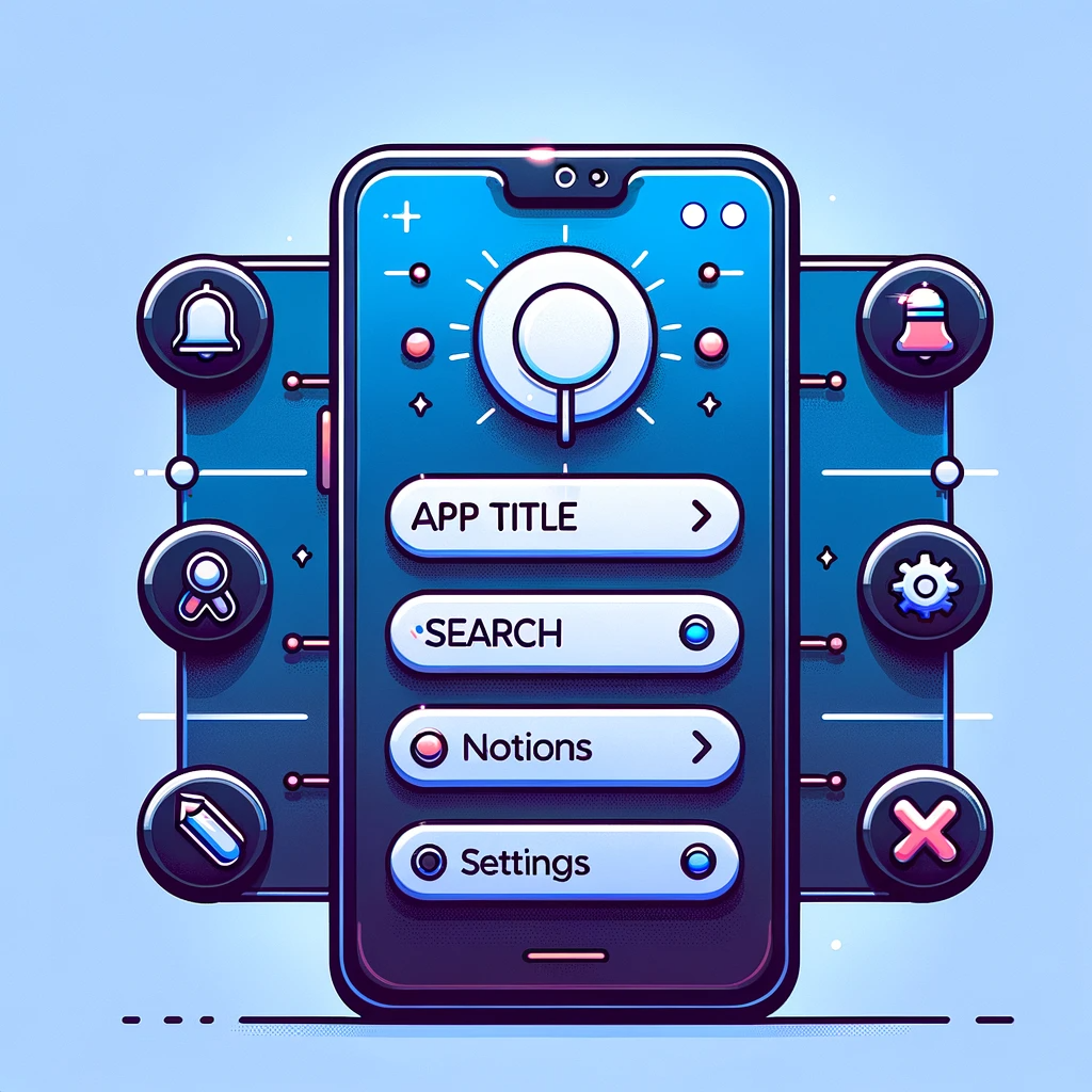
Key Features of the Flutter AppBar
- Title: Displays the current screen or page name, providing context to the user.
- Leading: Houses icons or widgets that control navigation, like a drawer menu or back button.
- Actions: Allows the placement of multiple widgets, typically icons, for additional navigation or information.
- FlexibleSpace: Offers a space that expands and collapses dynamically, often used to create a visual effect in the AppBar.
- Bottom: Can accommodate a TabBar for tabbed navigation within the app.
Customizing Your AppBar
Flutter’s AppBar is not just a one-size-fits-all widget. It can be tailored to fit the theme and function of your app. Here’s how you can customize it:
- Theme: Match the AppBar to your app’s color scheme and typography.
- Icons: Add functionality with built-in or custom icons.
- Elevation: Adjust the shadow intensity to create depth.
- Shape: Break the mold with custom shapes for your AppBar.
Implementing the AppBar
Adding an AppBar to your Flutter app is straightforward. Wrap your Scaffold body with an AppBar widget, and populate it with the desired elements. Here’s a basic example of an AppBar implementation:
AppBar(
  title: Text('Home'),
  leading: IconButton(
    icon: Icon(Icons.menu),
    onPressed: () {/* Open drawer */},
  ),
  actions: [
    IconButton(
      icon: Icon(Icons.search),
      onPressed: () {/* Search action */},
    ),
    IconButton(
      icon: Icon(Icons.more_vert),
      onPressed: () {/* More action */},
    ),
  ],
),
Basic Responsive AppBar
This example demonstrates a simple responsive AppBar that adjusts the title size and the number of action items based on the screen width.
AppBar(
  title: LayoutBuilder(
    builder: (context, constraints) {
      if (constraints.maxWidth > 600) {
        return Text('Home', style: TextStyle(fontSize: 26));
      } else {
        return Text('Home', style: TextStyle(fontSize: 20));
      }
    },
  ),
  actions: <Widget>[
    IconButton(
      icon: Icon(Icons.search),
      onPressed: () {/* Search action */},
    ),
    LayoutBuilder(
      builder: (context, constraints) {
        if (constraints.maxWidth > 600) {
          return IconButton(
            icon: Icon(Icons.notifications),
            onPressed: () {/* Notifications action */},
          );
        } else {
          return SizedBox.shrink();
        }
      },
    ),
  ],
),
AppBar with FlexibleSpace
This AppBar uses FlexibleSpaceBar to create a responsive background that can expand and contract as needed.
AppBar(
  title: Text('Profile'),
  flexibleSpace: FlexibleSpaceBar(
    background: Image.network(
      'https://example.com/background-image.jpg',
      fit: BoxFit.cover,
    ),
  ),
  actions: <Widget>[
    IconButton(
      icon: Icon(Icons.settings),
      onPressed: () {/* Settings action */},
    ),
  ],
),
AppBar with Custom Leading Widget
A responsive AppBar that changes the leading widget from a menu icon to a back button depending on whether it’s on a large screen (like a tablet) or a small screen (like a phone).
AppBar(
  title: Text('Dashboard'),
  leading: MediaQuery.of(context).size.width > 600
      ? null // Hides leading widget
      : IconButton(
          icon: Icon(Icons.arrow_back),
          onPressed: () {/* Handle back action */},
        ),
  actions: <Widget>[
    IconButton(
      icon: Icon(Icons.edit),
      onPressed: () {/* Edit action */},
    ),
  ],
),
Dynamic AppBar with TabBar
An AppBar that includes a TabBar and adjust its layout based on the screen orientation.
AppBar(
  title: Text('News Feed'),
  bottom: TabBar(
    tabs: [
      Tab(icon: Icon(Icons.trending_up), text: 'Trending'),
      Tab(icon: Icon(Icons.star), text: 'Favorites'),
      Tab(icon: Icon(Icons.person), text: 'Profile'),
    ],
  ),
  actions: <Widget>[
    IconButton(
      icon: Icon(Icons.refresh),
      onPressed: () {/* Refresh action */},
    ),
  ],
),
Best Practices for AppBar Design
- Consistency: Keep the AppBar consistent across different screens for a unified user experience.
- Simplicity: Avoid cluttering the AppBar with too many actions or elements.
- Accessibility: Ensure that AppBar elements are easily reachable and understandable for all users.
Conclusion
The AppBar in Flutter is an essential component that, when utilized effectively, can significantly enhance the navigation and overall look of your application. By following best practices and employing the customization options available, you can create an AppBar that not only looks great but also contributes to a smooth and intuitive user experience.
More Topics
ListTile Widget: A Deep Dive into Flutter ListTile Widget
Flexibility: The Flutter Wrap Widget Unwrapped
Mastering the Flutter Row Widget: A Comprehensive Guide
Understanding the Flutter Column Widget: A Comprehensive Guide
Master Flutter ListView Widgets: A Step-by-Step Visual Guide