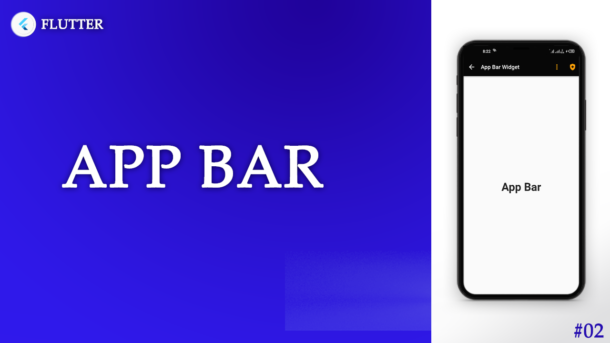
In this article, we will learn about the AppBar widget. We can use this package only inside Scaffold. We will also see some properties of appbar that we can be use in appbar widget and make it more beautiful according to the our requirements.
Let’s start the work:
Contents
- Overview
- Properties
- Property Details
- AppBar Example
- Conclusion
Overview
App Bar is the top area on all the screens. App bars are used to help users navigate through websites and platforms. It’s used for branding, screen titles, navigation, and actions. It Enable the users to move through out the application.
Properties
- backgroundColor
- foregroundColor
- surfaceTintColor
- shadowColor
- centerTitle
- titleSpacing
- elevation
- leading
- leadingWidth
- title
- actions
- toolbarHeight
- toolbarOpacity
- bottomOpacity
- shape
- automaticallyImplyLeading
- flexibleSpace
- bottom
- scrolledUnderElevation
- iconTheme
- actionsIconTheme
- textTheme
- primary
- excludeHeaderSemantics
- backwardsCompatibility
- toolbarTextStyle
- titleTextStyle
- systemOverlayStyle
Property Details
We will discuss details about the properties that are mostly used in every flutter project.
1) backgroundColor
With this peroperty we can change the background color of the appbar.
2) shadowColor
By using this property we can change the shadow color of the appbar.
3) centerTitle
This property has the bolean value (true or false). By using this we can align the title of appbar in center or at start. If true, then title will be in center. If false, then title will be at start left side.
4) titleSpacing
By using this we can set the space at the left side of the appbar title. If centerTitle value is false.
5) elevation
This property has double value. By using this we can set the range of the shadow of the appbar.
6) leading
This is the area of very first at left side of appbar. We can add a custom widget for our requirements. Otherwise in deafult back button in set for this property.
7) leadingWidth
By using this we can set the width of the leading.
8) title
This property has the widget value, we can assign text or other widgets according to our requirements.
9) actions
This property has the list of the widgets. We can use this property to assign different action at the right side of the appbar.
10) toolbarHeight
We use this property to set the height of appbar.
11) toolbarOpacity
We use this to assign the opacing of appbar.
12) automaticallyImplyLeading
This property has boolean value and by default its value is true. Due to this leading property has set back button by default. If we set this false. then what happen? guess that and write in the comments 🙂
13) systemOverlayStyle
By using this property we can update the back ground color and icon color of status bar. Status bar is the very first top bar that exist on bettery icon, mobile network signal icon, at left side you see time etc…
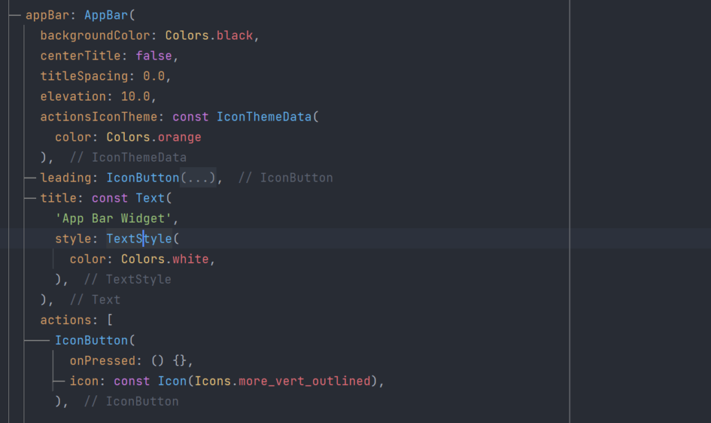
AppBar Example
Here is the example code of appbar
Conclusion
So, in this article, we learn that how can we use the flutter appbar widget and how can we use its properties. How to change background color of AppBar in flutter, how to remove space between title and back button in flutter AppBar, how to add shadow on AppBar in flutter and more…
GitHub Source Code: flutter99/flutter_app_example
If you like this article, please share with friends and support me. Thanks
Related Articles:
How to use PinPut Flutter Package in Flutter 2022
Scaffold – Widget of the day #01 | Flutter Beginner
How to use the Flutter Zoom Drawer Package
How to use the flutter native splash package
How to make a flutter counter app with the provider?
How to make Flutter Counter App with GetX


2 Responses
[…] TrendingAppBar – Widget of the Day #02 | Flutter Beginner Guide […]
[…] AppBar – Widget of the Day #02 | Flutter Beginner Guide […]