
Column Widget: Flutter has rapidly become one of the most popular frameworks for building cross-platform mobile applications. Its widget-based architecture allows developers to create highly customizable and efficient user interfaces. Among the multitude of widgets Flutter offers, the Column widget is a fundamental and versatile tool used for laying out a list of children vertically.
In this guide, we will delve into the Column widget, exploring its properties, and providing practical examples to help both new and experienced developers understand how to use it effectively.
Introduction to the Flutter Column Widget
The Column widget is used to display its children in a vertical array. In the world of Flutter layout widgets, it’s considered a multi-child layout widget, which means it can contain more than one child widget. It’s similar to how you would stack blocks vertically. This widget is incredibly useful when you want to organize multiple widgets along the vertical axis.
Key Properties of the Column Widget
Understanding the Column widget’s properties is crucial for leveraging its full potential:
children: The list of widgets that the Column contains.mainAxisAlignment: Determines how the children are aligned vertically.crossAxisAlignment: Defines the horizontal alignment of the children.mainAxisSize: Can be set toMainAxisSize.minorMainAxisSize.maxto minimize or maximize the amount of vertical space the Column occupies.
Practical Examples
Basic Column Usage
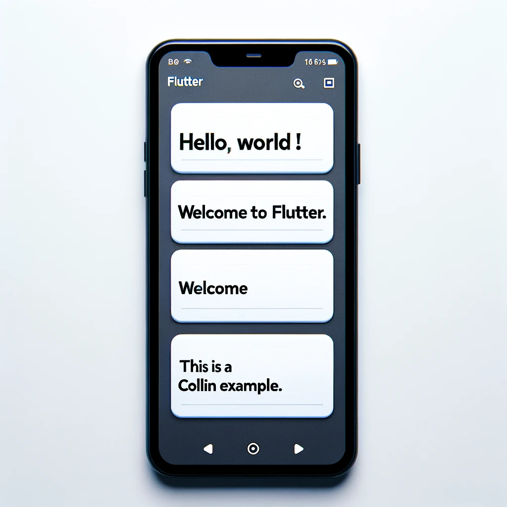
A simple example of a Column might include Text widgets stacked together:
Column(
  children: <Widget>[
    Text('Hello, World!'),
    Text('Welcome to Flutter.'),
    Text('This is a column example.'),
  ],
)
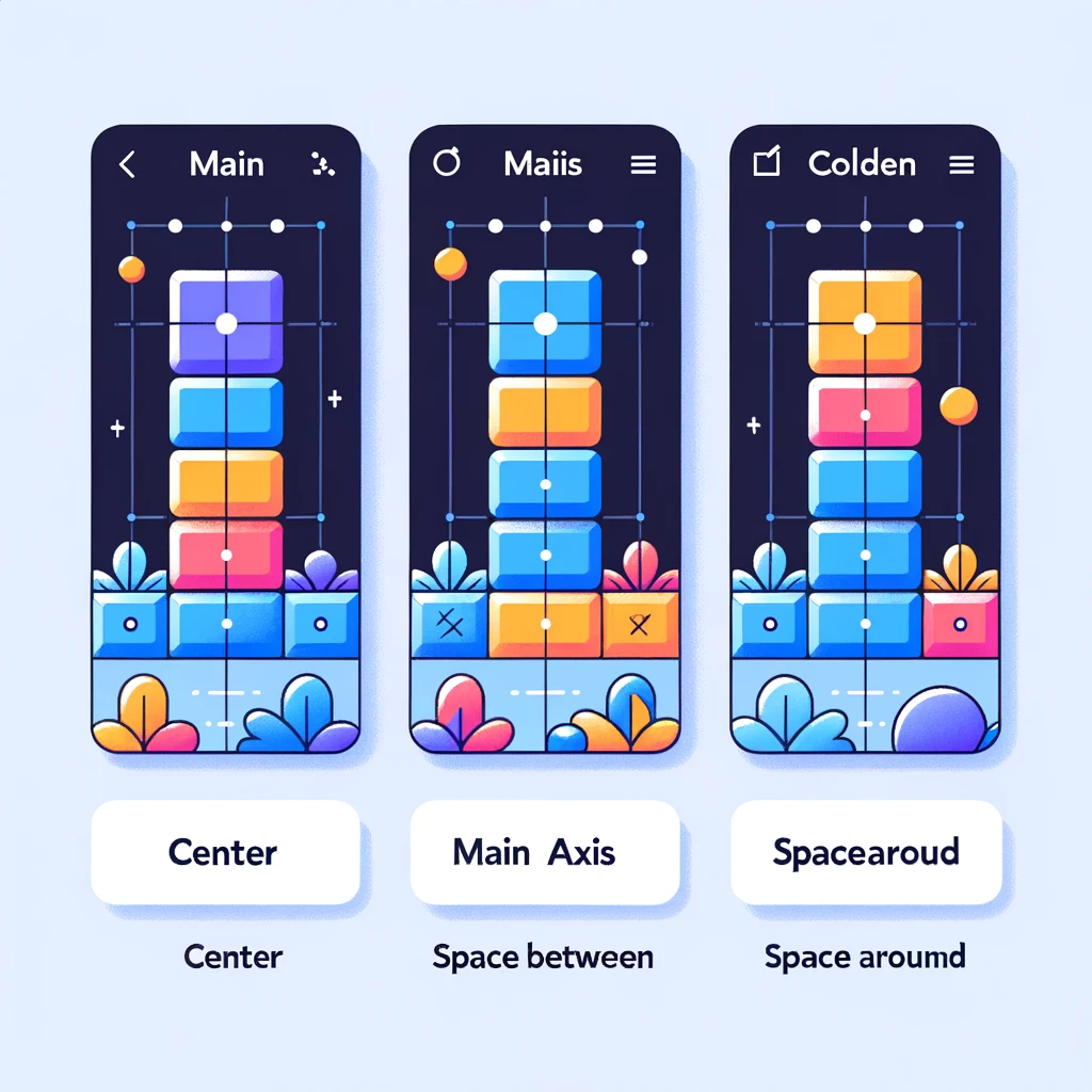
Aligning Children
You can align the children within the Column using mainAxisAlignment and crossAxisAlignment:
Column(
  mainAxisAlignment: MainAxisAlignment.center,
  crossAxisAlignment: CrossAxisAlignment.start,
  children: <Widget>[
    Text('Center aligned vertically'),
    Text('Left aligned horizontally'),
  ],
)
Handling Overflow
Occasionally, your content might exceed the screen height. Here’s how you handle it using the Expanded widget:
Column(
  children: <Widget>[
    Expanded(
      child: Container(
        color: Colors.amber,
        child: Text('This container is now expandable'),
      ),
    ),
    // Other children
  ],
)
Best Practices
When working with the Column widget, here are some best practices to keep in mind:
- Wrap with Flexible: If a child widget should be allowed to fill the remaining space, wrap it with a
Flexiblewidget. - Overflow Handling: If your Column overflows the screen, consider using a
ListVieworSingleChildScrollViewto prevent runtime errors. - Use Expanded Wisely: Similar to Flexible,
Expandedcan be used to distribute space among children but use it judiciously to avoid layout issues.
Conclusion
The Column widget is a staple in Flutter’s widget tree. It’s simple yet powerful, offering a straightforward way to arrange widgets vertically. Whether you are building a form, a list, or a complex layout, understanding how to use the Column widget is essential. By mastering its properties and adhering to best practices, you’ll be able to create clean and responsive layouts for your Flutter applications.
Remember, every widget in Flutter is a building block that, when combined thoughtfully, can lead to beautiful and functional user interfaces. The Column widget, with its ability to stack elements vertically, is one such fundamental building block. Happy coding!
More Topics:
How to use PinPut Flutter Package in Flutter 2022
Master Flutter ListView Widgets: A Step-by-Step Visual Guide
Flutter: A Deep Dive into the Container Widget with Examples
Flutter Animation: How to repeat the animation of the circle


