
In this article, we will learn how can we make a custom Gradient Button in Flutter. If you want to make the gradient elevated button, then this article also will help you a lot. There are two ways by which we can make the gradient button in the flutter framework. First, by using the Material, InkWell, and Ink Widget. Second, by using the Elevated Button Widget. We will cover both ways in this article.
Here is the video tutorial:
Let’s start the work:
First, we create the new project with the name custom_gradient_button with one screen that name is the next screen. In the next screen, we will show all the gradient buttons that we make from the custom gradient button widget.
code of main.dart file:
import 'package:custom_gredient_button/next_screen.dart';
import 'package:flutter/material.dart';

void main() {
  runApp(const MyApp());
}

class MyApp extends StatelessWidget {
  const MyApp({Key? key}) : super(key: key);

  // This widget is the root of your application.
  @override
  Widget build(BuildContext context) {
    return MaterialApp(
      debugShowCheckedModeBanner: false,
      title: 'Custom Gradient Button',
      theme: ThemeData(
        primarySwatch: Colors.blue,
      ),
      home: const NextScreen(),
    );
  }
}
Let’s make a custom widget for the gradient button, we will write the name for that file as custom_button.dart
import 'package:flutter/material.dart';

class CustomButton extends StatelessWidget {
  final Function()? onTap;
  final String? btnText;
  final Color? firstColor;
  final Color? secondColor;

  const CustomButton({Key? key,
    required this.onTap,
    this.btnText = 'Gradient Button',
    this.firstColor = Colors.green,
    this.secondColor = Colors.greenAccent,
}) : super(key: key);

  @override
  Widget build(BuildContext context) {
    double height = MediaQuery.of(context).size.height;
    double width = MediaQuery.of(context).size.width;
    return Padding(
      padding: const EdgeInsets.symmetric(horizontal: 24.0),
      child: InkWell(
        onTap: onTap,
        borderRadius: BorderRadius.circular(10.0),
        splashColor: Colors.blue.withOpacity(0.4),
        child: Ink(
          height: 50.0,
          width: width,
          decoration: BoxDecoration(
            borderRadius: BorderRadius.circular(10.0),
            gradient: LinearGradient(
              colors: [
                firstColor!,
                secondColor!,
              ],
              begin: Alignment.topRight,
              end: Alignment.bottomLeft,
            ),
          ),
          child: Center(
            child: Text(btnText!,
              style: const TextStyle(
                fontSize: 24.0,
                color: Colors.white,
              ),
            ),
          ),
        ),
      ),
    );
  }
}
Now, we will call this custom widget in our next_screen.dart file.
import 'package:custom_gredient_button/widgets/custom_button.dart';
import 'package:flutter/material.dart';
class NextScreen extends StatelessWidget {
const NextScreen({Key? key}) : super(key: key);
@override
Widget build(BuildContext context) {
double height = MediaQuery.of(context).size.height;
double width = MediaQuery.of(context).size.width;
return Scaffold(
backgroundColor: Colors.white,
/// appbar
appBar: AppBar(
centerTitle: true,
title: const Text('Custom Gradient Button'),
elevation: 0.0,
),
/// body
body: Column(
crossAxisAlignment: CrossAxisAlignment.start,
mainAxisAlignment: MainAxisAlignment.start,
children: [
const SizedBox(height: 40.0),
CustomButton(
onTap: (){},
),
const SizedBox(height: 40.0),
CustomButton(
onTap: (){},
firstColor: Colors.deepPurple,
secondColor: Colors.deepPurpleAccent,
),
const SizedBox(height: 40.0),
CustomButton(
onTap: (){},
firstColor: Colors.red,
secondColor: Colors.redAccent,
),
const SizedBox(height: 40.0),
CustomButton(
onTap: (){},
firstColor: Colors.orange,
secondColor: Colors.orangeAccent,
),
const SizedBox(height: 40.0),
CustomButton(
onTap: (){},
firstColor: Colors.pink,
secondColor: Colors.pinkAccent,
),
],
),
);
}
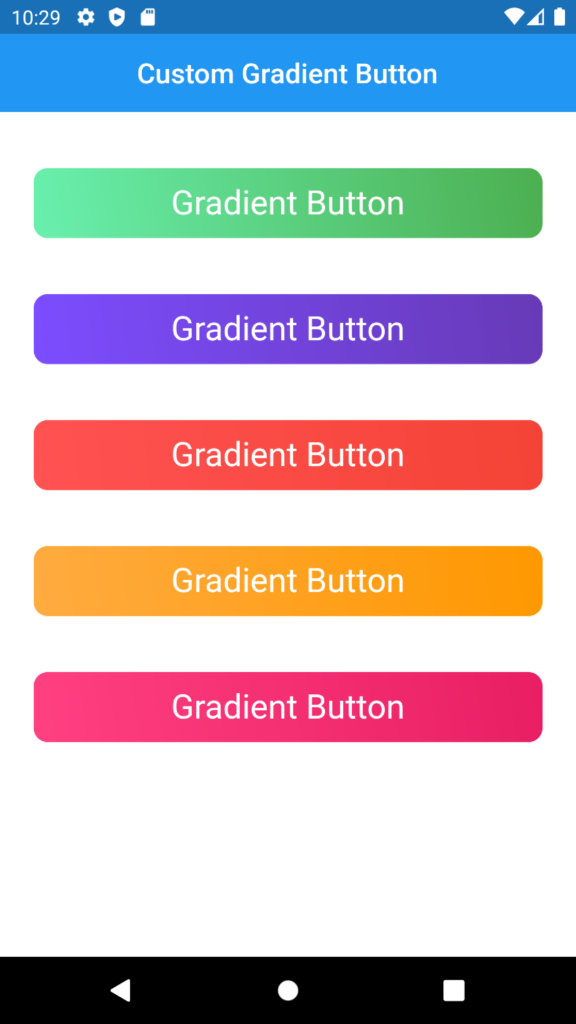
}The output of the code will be:
Here is the complete code of the project:
//// main.dart file code

import 'package:custom_gredient_button/next_screen.dart';
import 'package:flutter/material.dart';

void main() {
  runApp(const MyApp());
}

class MyApp extends StatelessWidget {
  const MyApp({Key? key}) : super(key: key);

  // This widget is the root of your application.
  @override
  Widget build(BuildContext context) {
    return MaterialApp(
      debugShowCheckedModeBanner: false,
      title: 'Custom Gradient Button',
      theme: ThemeData(
        primarySwatch: Colors.blue,
      ),
      home: const NextScreen(),
    );
  }
}


//// custom_button.dart file code

import 'package:flutter/material.dart';

class CustomButton extends StatelessWidget {
  final Function()? onTap;
  final String? btnText;
  final Color? firstColor;
  final Color? secondColor;

  const CustomButton({Key? key,
    required this.onTap,
    this.btnText = 'Gradient Button',
    this.firstColor = Colors.green,
    this.secondColor = Colors.greenAccent,
}) : super(key: key);

  @override
  Widget build(BuildContext context) {
    double height = MediaQuery.of(context).size.height;
    double width = MediaQuery.of(context).size.width;
    return Padding(
      padding: const EdgeInsets.symmetric(horizontal: 24.0),
      child: InkWell(
        onTap: onTap,
        borderRadius: BorderRadius.circular(10.0),
        splashColor: Colors.blue.withOpacity(0.4),
        child: Ink(
          height: 50.0,
          width: width,
          decoration: BoxDecoration(
            borderRadius: BorderRadius.circular(10.0),
            gradient: LinearGradient(
              colors: [
                firstColor!,
                secondColor!,
              ],
              begin: Alignment.topRight,
              end: Alignment.bottomLeft,
            ),
          ),
          child: Center(
            child: Text(btnText!,
              style: const TextStyle(
                fontSize: 24.0,
                color: Colors.white,
              ),
            ),
          ),
        ),
      ),
    );
  }
}


//// next_screen.dart file code


import 'package:custom_gredient_button/widgets/custom_button.dart';
import 'package:flutter/material.dart';

class NextScreen extends StatelessWidget {
  const NextScreen({Key? key}) : super(key: key);

  @override
  Widget build(BuildContext context) {
    double height = MediaQuery.of(context).size.height;
    double width = MediaQuery.of(context).size.width;

    return Scaffold(
      backgroundColor: Colors.white,

      /// appbar
      appBar: AppBar(
        centerTitle: true,
        title: const Text('Custom Gradient Button'),
        elevation: 0.0,
      ),

      /// body
      body: Column(
        crossAxisAlignment: CrossAxisAlignment.start,
        mainAxisAlignment: MainAxisAlignment.start,
        children: [

          const SizedBox(height: 40.0),

          CustomButton(
              onTap: (){},
          ),
          const SizedBox(height: 40.0),
          CustomButton(
            onTap: (){},
            firstColor: Colors.deepPurple,
            secondColor: Colors.deepPurpleAccent,
          ),

          const SizedBox(height: 40.0),
          CustomButton(
            onTap: (){},
            firstColor: Colors.red,
            secondColor: Colors.redAccent,
          ),

          const SizedBox(height: 40.0),
          CustomButton(
            onTap: (){},
            firstColor: Colors.orange,
            secondColor: Colors.orangeAccent,
          ),

          const SizedBox(height: 40.0),
          CustomButton(
            onTap: (){},
            firstColor: Colors.pink,
            secondColor: Colors.pinkAccent,
          ),
        ],
      ),
    );
  }
}
You can download this code from GitHub:
Related Articles:
How to make gradient icon in Flutter 2022
Lottie Animation add in a Flutter project
Flutter – How to call SetState in Alert Dialog (2022)
1 Response
[…] Flutter UI Custom Gradient Button […]