Hello flutter developers this is the series of Flutter where I will write blogs on Flutter widgets with their all properties. So, basically, I publish articles regularly. In this article, I will let you know about the Flutter Container widget and also will discuss the all properties of the Container widget.
The Container widget is like a box that contains many other widgets. We can be used it to adjust the padding, margin, and background color of its child widget. It can also be used to add a border, a box shadow, and/or a RoundedRectangleBorder to itself and more…
Here is an example of using a Container to adjust the padding and background color of a Text widget:
Container(
  padding: EdgeInsets.all(20),
  color: Colors.yellow,
  child: Text('Hello World'),
),
This was the basic introduction to the container widget, now we will discuss all properties that we can use inside the container widget as its property.
All Properties of the Flutter Container widget
Here is a list of the properties that you can use with a Container widget in Flutter:
alignment
color
padding
margin
decoration
constraints
height
width
child
alignment
This property is used to align the content within the container. We can align the content in the center, left, right and bottom.
Color
By using this property, we can give the color to the container widget.
padding
Through this property of the container widget, we can add space around the content within the container. For this, we use EdgeInsect class. We can use it in different ways like…
EdgeInsect.only(left: 20, right: 20, top: 20, bottom: 20),


EdgeInsect.all(20.0),


EdgeInsets.zero,


EdgeInsets.symmetric(horizontal: 20, vertical: 20),


EdgeInsets.fromLTRB(20, 20, 20, 20),


EdgeInsets.fromWindowPadding(WindowPadding.zero, MediaQuery.of(context).size.height),
margin
By using this property of the container widget we can add space outside the container. For this, we can give space the same as we are giving in the padding property.
height
We use this property to give the height to the container widget. The value of height should be in double data type.
width
We use this property to give the height to the container widget. The value of width should be in double data type.
transform
The transform property of a Container widget allows you to apply a transformation matrix to the container. This can be used to rotate, scale, translate, or skew the container and its children. we can use it in this way:
transform: Matrix4.rotationZ(45 * pi / 180),
transformAlignment
The transformAlignment property of a Container widget specifies the alignment of the origin of the container’s coordinate system within the container. This determines the point at which the transform matrix is applied.
transform: Matrix4.rotationZ(45 * pi / 180),
transformAlignment: Alignment.topLeft,
foregroundDecoration
The foregroundDecoration property of a Container widget allows you to specify a decoration to paint over the container’s child widgets.
The foregroundDecoration is drawn on top of the container’s child widgets, and it is not included in the container’s padding. This means that the child widgets will be positioned as if the decoration is not present, and the decoration will overlap the child widgets.
It can be decorated exactly like we can use decoration property.
clipBehavior
The clipBehavior property of a Container widget specifies how the container should clip its overflowing children.
By default, the clipBehavior is set to Clip.none, which means that the container will not clip its children. If a child widget overflows the container, it will be visible outside the container’s bounds.
You can use the clipBehavior property to specify a different clipping behavior for the container. For example, you can set it to Clip.hardEdge to clip the children using a hard edge, or you can set it to Clip.antiAlias to clip the children using anti-aliasing.
decoration
The decoration property of the container widget is used to decorate the box (container), we can give border radius, color, border, shadow, etc…
- color
- image
- border
- shape
- borderRadius
- boxShadow
- gradient
- blendMode
color: AppColors.silverColor,


image: DecorationImage(
  image: AssetImage('assets/images/ab.png'),
),


border: Border(
      bottom: BorderSide(color: Colors.orange, width: 2.0),
      top: BorderSide(color: Colors.orange, width: 2.0),
      left: BorderSide(color: Colors.orange, width: 2.0),
      right: BorderSide(color: Colors.orange, width: 2.0),
    ),

shape: BoxShape.circle,


gradient: LinearGradient(
      begin: Alignment.topCenter,
      end: Alignment.bottomCenter,
      colors: [Colors.red, Colors.orange, Colors.yellow],
    ),


borderRadius: BorderRadius.circular(6.0),


boxShadow: [
          BoxShadow(
            color: Colors.orange,
            blurRadius: 20,
            spreadRadius: 30,
            offset: Offset(4.0, 4.0),
            ),
        ],


clipBehavior: Clip.hardEdge,
Here was the complete details about the Flutter Container widget with its all properties
Flutter Container widget
Read More
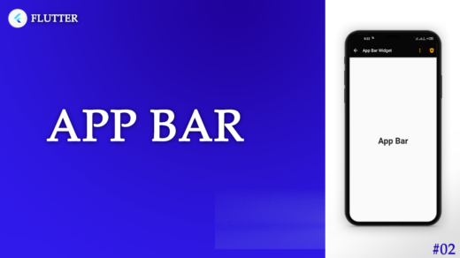
Flutter App Bar widget and it’s all properties | Flutter Widgets
Flutter InkWell: How to add Ripple Effect on any widget
Complete detail about Flutter state managements in the flutter
Flutter Animation: How to Rotate a Circle in the Flutter
Flutter Animation: How to repeat the animation of the circle