Hello flutter geeks this is the series of Flutter where I will write blogs on Flutter widgets with their all properties. So, basically, I publish articles regularly. In this article, I will let you know about the Flutter App Bar widget and also will discuss the all properties of the App Bar widget.
The AppBar widget is a top app bar in the mobile application that can be used to display a variety of information and actions. It is typically placed at the top of the screen and can be styled that will suit the design of your app.
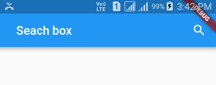
Here is an example of the Flutter App Bar widget.
Scaffold(
        appBar: AppBar(
          title: Text('My App'),
          actions: [
            IconButton(
              icon: Icon(Icons.search),
              onPressed: () {
                // Perform some action
              },
            ),
            IconButton(
              icon: Icon(Icons.more_vert),
              onPressed: () {
                // Perform some action
              },
            ),
          ],
        ),
        body: Center(
          child: Text('Hello World'),
        ),
      ),
Properties of Flutter App Bar widget
Here is a list of some of the main properties that you can use to customize the AppBar widget in Flutter:
leading
title
actions
bottom
bacgroundColor
elevation
shape
brightness
iconTheme
textTheme
centerTitle
toolbarOpacity
bottomOpacity
automaticallyImplyLeading
primary
titleSpacing
toolbarHeight
leadingWidth
flexibleSpace
collapseMode
leading
This property allows you to specify a widget that appears at the start of the app bar, typically an Icon or a BackButton.
title
The text property of Flutter App Bar allows you to specify a widget that appears in the center of the app bar, typically a Text widget.
actions
The actions property allows you to specify a list of widgets that appear at the end of the app bar, typically IconButton widgets.
bottom
Flutter App Bar widget bottom property allows you to specify a widget that appears at the bottom of the app bar, below the main content.
backgroundColor
The backgroundColor property allows you to specify the background color of the app bar.
elevation
This property allows you to specify the shadow that is cast by the app bar.
shape
This property allows you to specify the shape of the app bar.
brightness
This property allows you to specify the brightness of the app bar.
iconTheme
This property allows you to specify the theme for the icons in the app bar.
textTheme
This property allows you to specify the theme for the text in the app bar.
centerTitle
This property allows you to specify whether the title should be centered in the app bar.
toolBarOpacity
This property allows you to specify the opacity of the app bar.
bottomOpacity
This property allows you to specify the opacity of the widget at the bottom of the app bar.
automaticallyImplyLeading
This property allows you to specify whether the app bar should automatically imply a leading widget (such as a BackButton).
primary
This property allows you to specify whether the app bar should be displayed at the top of the screen (true) or the bottom of the screen (false).
titleSpacing
This property allows you to specify the amount of space that should be used between the title and the leading and actions widgets.
toolbarHeight
This property allows you to specify the height of the app bar.
leadingWidth
This property allows you to specify the width of the leading widget in the app bar.
flexibleSpace
This property allows you to specify a widget that occupies the flexible space between the app bar and the rest of the content.
collapseMode
This property allows you to specify how the app bar should behave when the screen is scrolled.
Here was the detail about the Flutter App Bar widget with its all properties
Flutter App Bar Widget
I hope this article helps you a lot to understand the new things about the Flutter App Bar widget. If you like this article, please write down your thoughts about this blog.
Read More
Flutter InkWell: How to add Ripple Effect on any widget
How to change app name in Flutter – The Perfect way in 2022
Flutter Animation: How to animate a Circle in the Flutter








1 Response
[…] Flutter App Bar widget and it’s all properties | Flutter Widgets […]