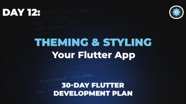
Day 12: Theming & Styling Your Flutter App
Welcome back to our 30-Day Flutter Challenge! 🎉 Today, we’re diving into Theming & Styling in Flutter. A well-themed app not only looks professional but also provides a seamless user experience.
Let’s explore:
✅ ThemeData for consistent styling
✅ Customizing colors, typography, and buttons
✅ Dark mode implementation
1. Understanding ThemeData
Flutter’s ThemeData class helps maintain a consistent look across your app. Instead of hardcoding styles, define them once and reuse them everywhere.
🔹 Basic Theme Setup
Try it! Change the primary color using the dropdown above and see the code update.
2. Customizing Colors, Typography & Buttons
🎨 Custom Colors
Experiment: Try different color combinations using the dropdowns above.
✒️ Custom Typography
Tip: Use Google Fonts (google_fonts package) for more font options.
🛑 Custom Button Styles
Try it! Adjust the slider to change the button’s border radius.
3. Implementing Dark Mode 🌙
Users love dark mode! Here’s how to add it:
🔀 Toggle Between Light & Dark Theme
Dark Mode Demo
This is some sample content that changes with the theme.
Try it! Flip the switch above to see the theme change.
📌 Quick Recap
✔ ThemeData ensures consistency.
✔ Customize colors, fonts, and buttons for brand identity.
✔ Dark mode improves user experience.
🚀 Challenge for You!
🔹 Create a custom theme with your brand colors.
🔹 Add a toggle button for dark mode in your app.
Share your code in the comments! Let’s see your creativity. 👇
Next Up: Day 13 – State Management with Provider!
Happy Fluttering! 💙
#Flutter30Days #LearnFlutter